For Web Developers at the start of their journey, curious about design.
5 years ago
|4 min read
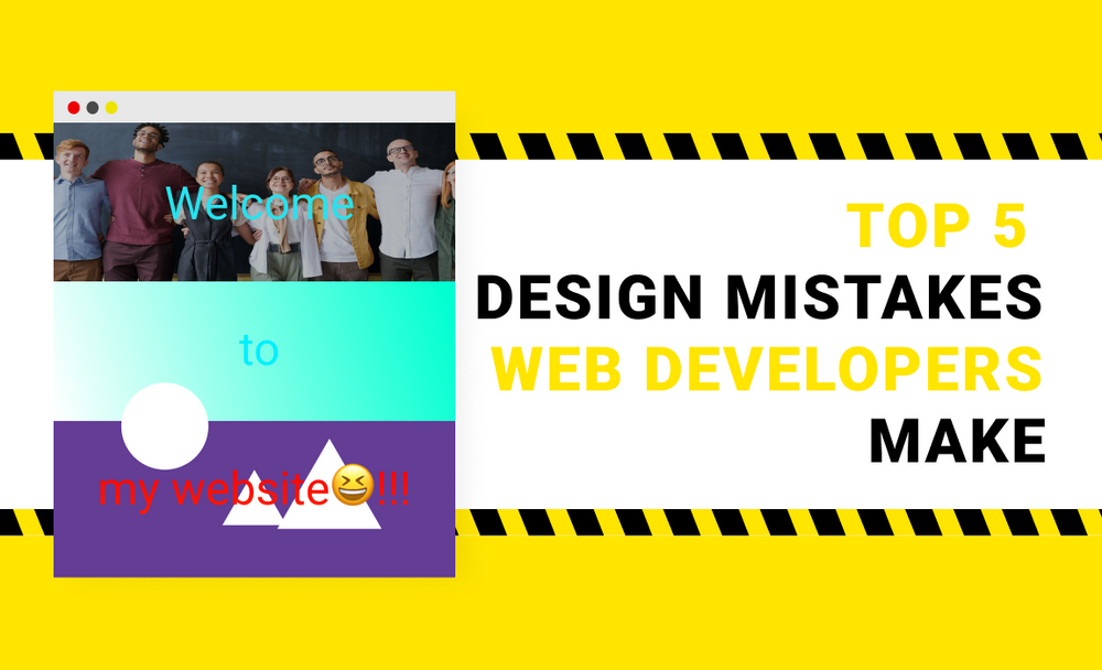
Design is an art. As such there's no right or wrong 😤!
With that said, here are the most common beginner mistakes I see 😄.
1 - Too many colors.
This is by far the most common mistake new devs make. And I get it. Black and white is too dull for the enlightened CSS dev. Can't help enhancing the page with background-image and background-color.
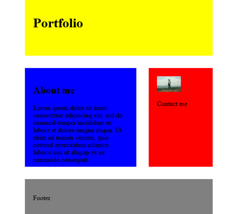
So, what's wrong with this?
Well, it's like being hit by a wall of light 😆. Every color is fighting for the spotlight. There's no way the users can focus on the content.
This example is extreme. But my point is, colors are really eye-catching. If you use too many, you might confuse and even annoy your readers.
Solution:
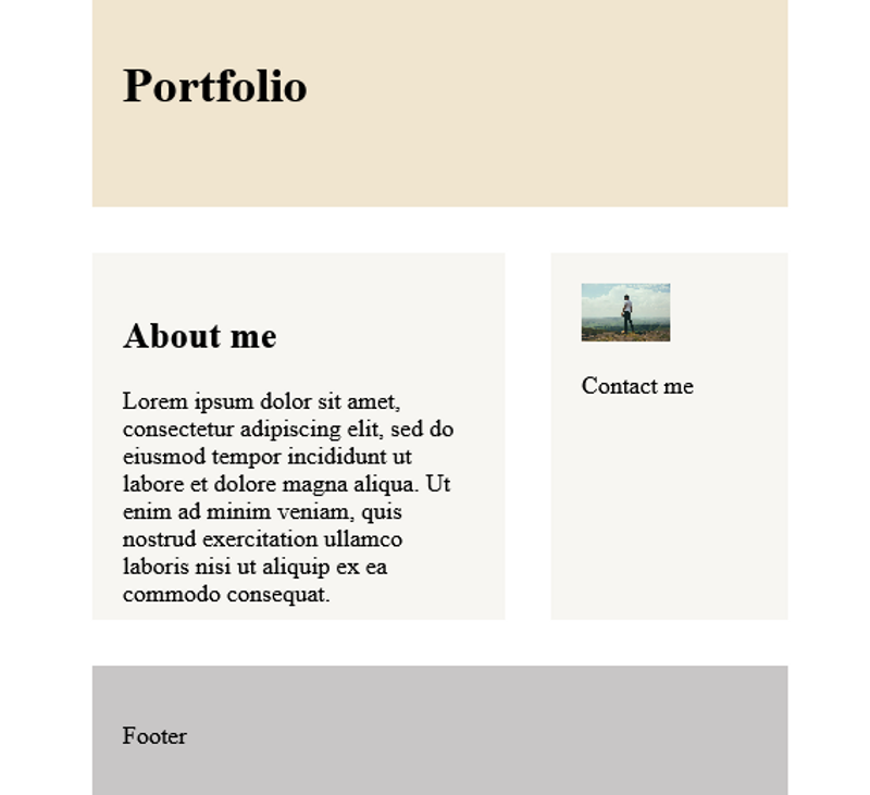
- Use less colors. Consider removing any colors that doesn't have any meaning behind it or decreasing their intensity.
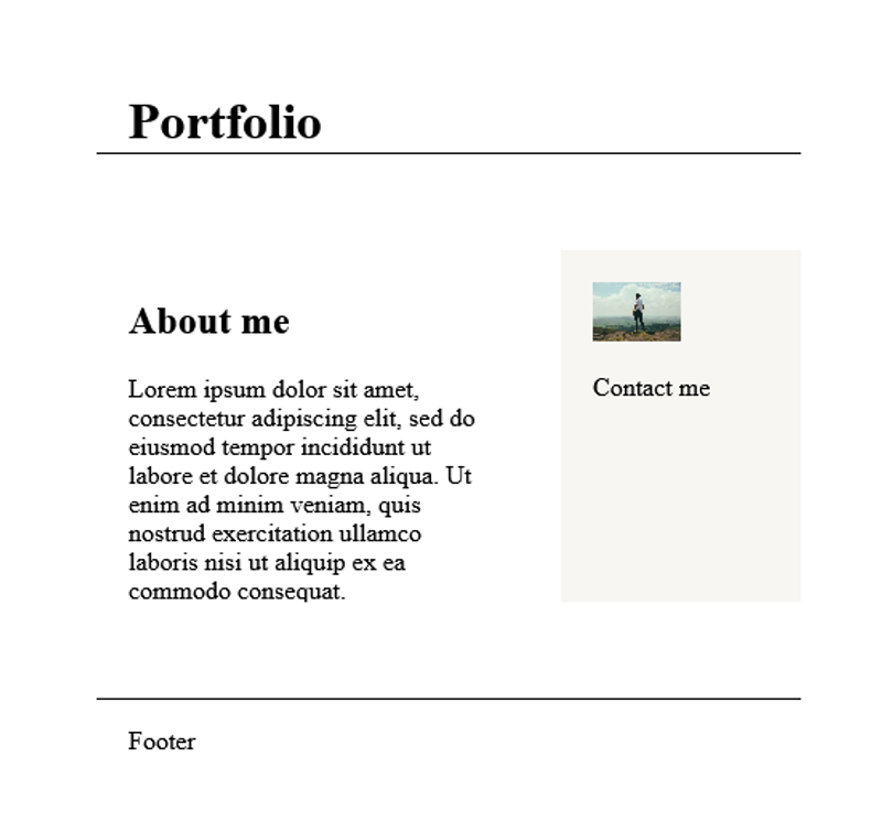
- Use colors that go well with each other.
I know it's super hard to pick colors at first. It was my number one struggle beside centering divs.
How to be better at picking colors?
- Just browse around for inspiration and bookmark the sites you like.
- Look for color palette websites. My favorite one is colorHunt.
2 - Gradients.
Nothing screams amateur more than a big awkward gradient.
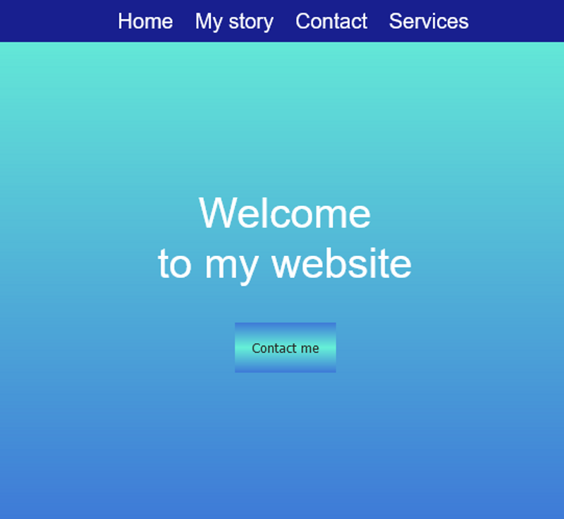
What's wrong with gradients? Nothing. Only that they really grab the users' attention. So it's a big turn off if they are ugly or don't fit with the overall design.
There's a reason 99% of the pages you visit don't use gradients.
Now, I'm not saying gradients are bad and you shouldn't use them - I can almost hear the "booo, gatekeeper!" - but rather you might want to think twice about how your background: linear-gradient(...) button, that changes colors on hover and focus, fits with the rest of the page 😄.
Plus it's just hard to make a nice gradient.
Solution:
- Trust the stats, use sparingly 🤭.
- Use colorSpace to make better gradients.
3 - Not enough contrast difference between text and background.
Related to the 1st point. Because black and white text is too boring we get things like:
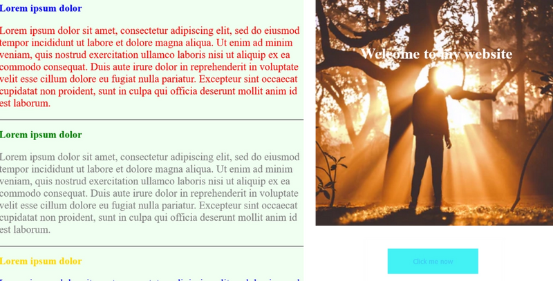
Solution:
- Go easy with your newly found powers 😁.
In most cases, it's a good idea to keep the text black or white, especially for lenghty text. The world is not ready for multicolored text yet.
- Add contrast between the background color and the text.

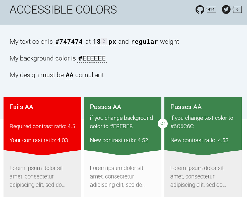
You can also check contrast with Accessible Colors. They'll tell you if your text would be hard to read for some and suggest alternative colors.
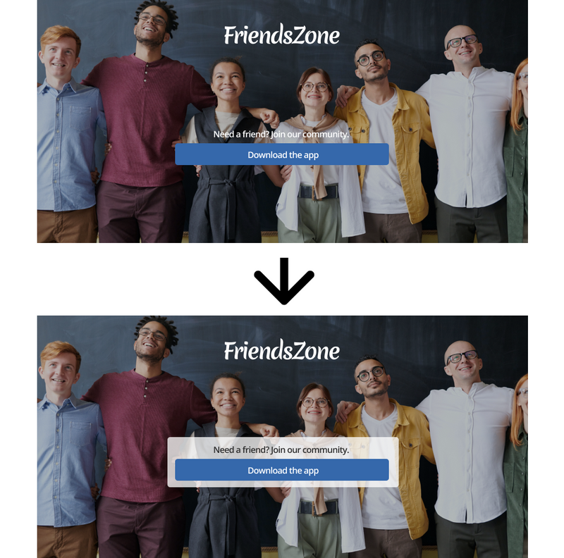
- Add contrast to the text above the image.
Darken the image using filter or an overlay.

Or wrap the text in a semi-transparent/white container.
4 - Misalignments and spacing.
Everyone make those mistakes. Then as we build more, we become more mindful of how the elements we create should fit with other elements to create a more coherent design.
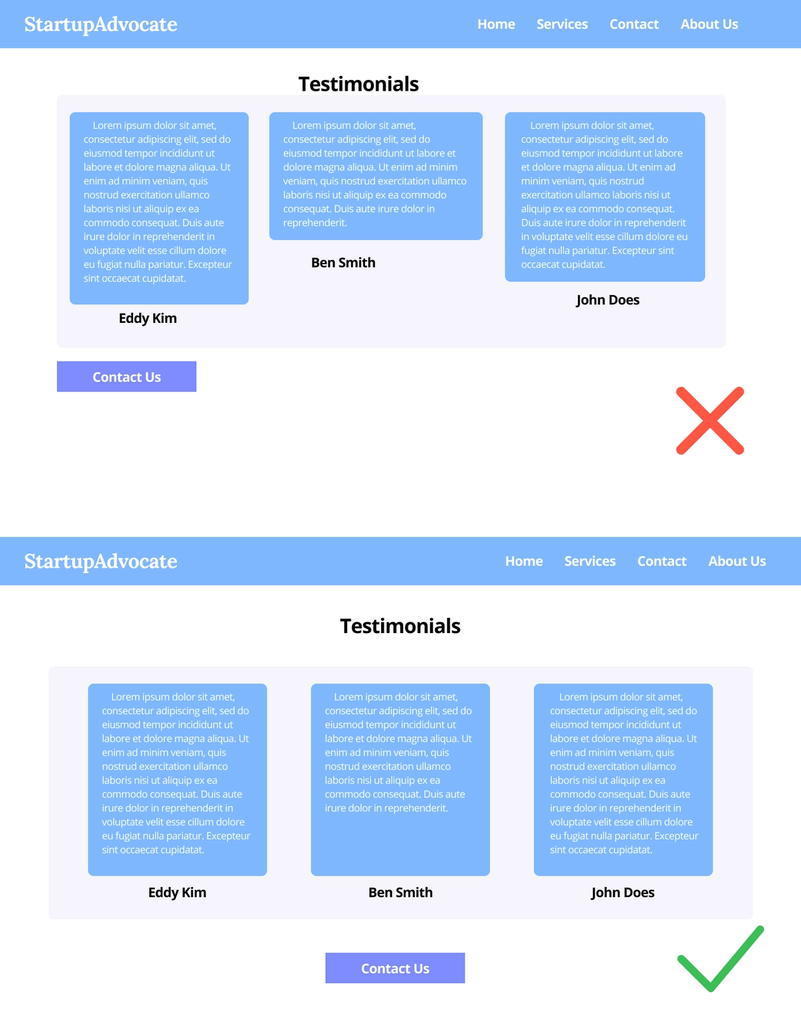
Solution:
- Every element you add should be connected with another element or both sides of the page.
- Keep the spacing consistent.
- Keep building more projects. Seriously, there are no shortcuts.
- Get feedback and/or compare with your favorite websites. (It would also make nice trainings to clone those websites.)
5 - Inconsistent headers
Avoid making headers too big compared to the text around them.
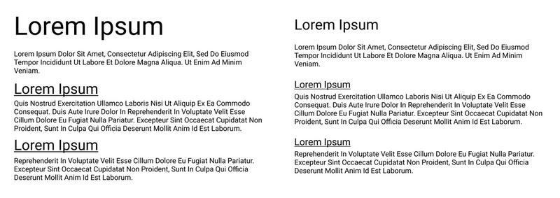
Also most of the time, one to two font families is enough:
- An easily readable font for lengthy text.
- And perhaps a more fancy font for headers.
- Google Fonts is your friend👌.
That's it!
I hope you've found this short guide useful. If you are making any of the mistakes above, it's super fine. I've made them all 😂. Keep building 💪!!
Comments
Be the first one to comment.