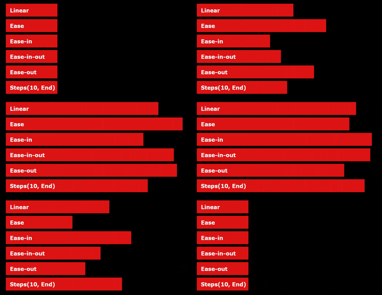
So you want to animate with CSS? Great, let's get started 😄! Most properties can be animated: width, color, opacity, transform, etc. In this tutoria
6 years ago
|4 min read

So you want to animate with CSS? Great, let's get started 😄!
Most properties can be animated: width, color, opacity, transform, etc. In this tutorial, we are going to focus on transform.
With CSS transform we can rotate, scale, skew, or translate an html element.
Try hovering ( or clicking if you are on mobile) on the ninja images:
No animations yet. Here's the code:
<img class="ninja1" src="https://ljc-dev.github.io/fluffy-octo-adventure/nin.png">
<img class="ninja2" src="https://ljc-dev.github.io/fluffy-octo-adventure/nin.png">
<img class="ninja3" src="https://ljc-dev.github.io/fluffy-octo-adventure/nin.png">
img {
  display: block;
  width: 200px;
  height: 200px;
  object-fit: contain;
}

.ninja1:hover {
  transform: translateY(50px);
}

.ninja2:hover {
  transform: scale(1.5);
}

.ninja3:hover {
  transform: rotate(45deg);
}
On hover:
translateY(50px) moves ninja1 50px down.
scale(1.5) makes ninja2 1.5 times bigger.
rotate(45deg) rotates ninja3 45deg clockwise.
Transitions
Now let's see how we can animate those transformations with CSS transitions.
A transition animates the changes of one or multiple properties.
We add a 2s transition on transform with the following:
.ninja1, .ninja2, .ninja3 {
  transition-property: transform;
  transition-duration: 2s;
}
- transition-property takes the name of the property to add a transition to. We can add multiple properties with the keyword all or separating each property with commas like transition-property: transform, opacity
- transition-duration sets the duration of the transition.
We can also use the shorthand transition:
.ninja1, .ninja2, .ninja3 {
  transition: transform 2s;
}
This code and the one above are the same.
We get an animation on hover:
We can change the feel of the transition with transition-timing-function.

Defaults to ease. Let's try ease-in-out.
And finally add a 1s delay with transition-delay.
.ninja1, .ninja2, .ninja3 {
  transition-property: transform;
  transition-duration: 2s;
  transition-timing-function: ease-in-out;
  transition-delay: 1s;
}
Or:
.ninja1, .ninja2, .ninja3 {
  transition: transform 2s ease-in-out 1s;
}
If you hover again on the ninja images, you'll notice the animations start with 1s delay.
@keyframes animations
Another way to animate in CSS is with animation and @keyframes rules.
@keyframes rules define steps in an animation:
@keyframes moveDown {
  0% {
    transform: translateY(0);
  }
  100% {
    transform: translateY(50px);
  }
}
Some like to replace 0% and 100% with their keywords equivalent from and to.
You can add as many keyframes as you want from 0 to 100% and animate as many properties as you want.
This weird animation would totally work 👍.
@keyframes weirdAnim {
  0% { transform: translateY(0); }
  11% {
    width: 50px;
    background-color: green;
    transform: rotate(90deg);
  }
  50% { height: 100px;}
  66% { transform: rotate(-720deg); }
  99% {
    border-radius: 200px;
    background-color: black;
  }
  100% {
    background-color: red;
  }
}
To run it we need to refer to its name with animation-name:
.ninja1{
  animation-name: weirdAnim;
}
And give it a duration with animation-duration:
.ninja1{
  animation-name: weirdAnim;
  animation-duration: 5s;
}
With the animation shorthand:
.ninja1{
  animation: weirdAnim 5s;
}
And we get this monstrosity:
(click on rerun to play the animation again)
Same with transitions we can change the feel of the animation with an animation-timing-function. And add a delay with animation-delay.
.ninja1{
  animation-name: weirdAnim;
  animation-duration: 5s;
  animation-timing-function: ease;
  animation-delay: 1s;
}
Or:
.ninja1{
  animation: weirdAnim 5s ease 1s;
}
With keyframes animation, we can also decide how many times to run an animation with animation-iteration-count. Defaults to 1. Setting it to infinite makes it run indefinitely.
I've used infinite for the cover animation. Here is the code for my text animation:
There are two more advanced animation properties:
animation-direction:
- normal (default) starts from the 1st keyframe.
- reverse starts from the last keyframe.
- alternate starts from the 1st to last but if the animation is repeated the next animation will go from last to first.
- alternate-reverse is the same as alternate except it starts from the last keyframe. (example)
animation-fill-mode. It's set to forwards when we want to keep the animation state after it finished playing.
We are going to slide down the kpop girl image three times and hold the final position with forwards.
<img class="kpop" src="https://ljc-dev.github.io/fluffy-octo-adventure/kpop.png">
img {
  display: block;
  width: 200px;
  height: 200px;
  object-fit: contain;
}

@keyframes slideDown {
  0% {
    transform: translateY(0%);
  }
  100% {
    transform: translateY(75%);
  }
}

.kpop{
  animation-name: slideDown;
  animation-duration: 3s;
  animation-iteration-count: 3;
  animation-direction: alternate;
  animation-fill-mode: forwards;
}
Or:
.kpop{
  animation: slideDown 3s 3 alternate forwards;
}
Notice how alternate is used to change the direction of the 2nd iteration. So instead of jumping back up and sliding down again, the animation runs in reverse and slides up.
And that's the end of this intro to transitions and keyframes animations.
One thing to be careful with shorthands is not to mix the properties order. You can omit the properties you won't change but don't put duration before the animation name for example.
Here's the correct properties order for transitions and animations:
transition: property duration timing-function delay;
animation: name duration timing-function delay iteration-count direction fill-mode;
Thanks for reading!!
I hope you've got a better idea on how to animate with CSS now.
I've posted below a small series of common CSS animations - some with js. If you have any questions, leave a comment or hit me up on socials 👌.
Happy coding 👋!
- button transition opacity on hover & scale on active
- spinner
- progress bar anim
- menu links bottom line on hover
- scroll to top with fade up anim
- hamburger slide down menu
- hamburger slide right menu + overlay
- post cover for those who are curious how I did it (not responsive)
Comments
Be the first one to comment.